


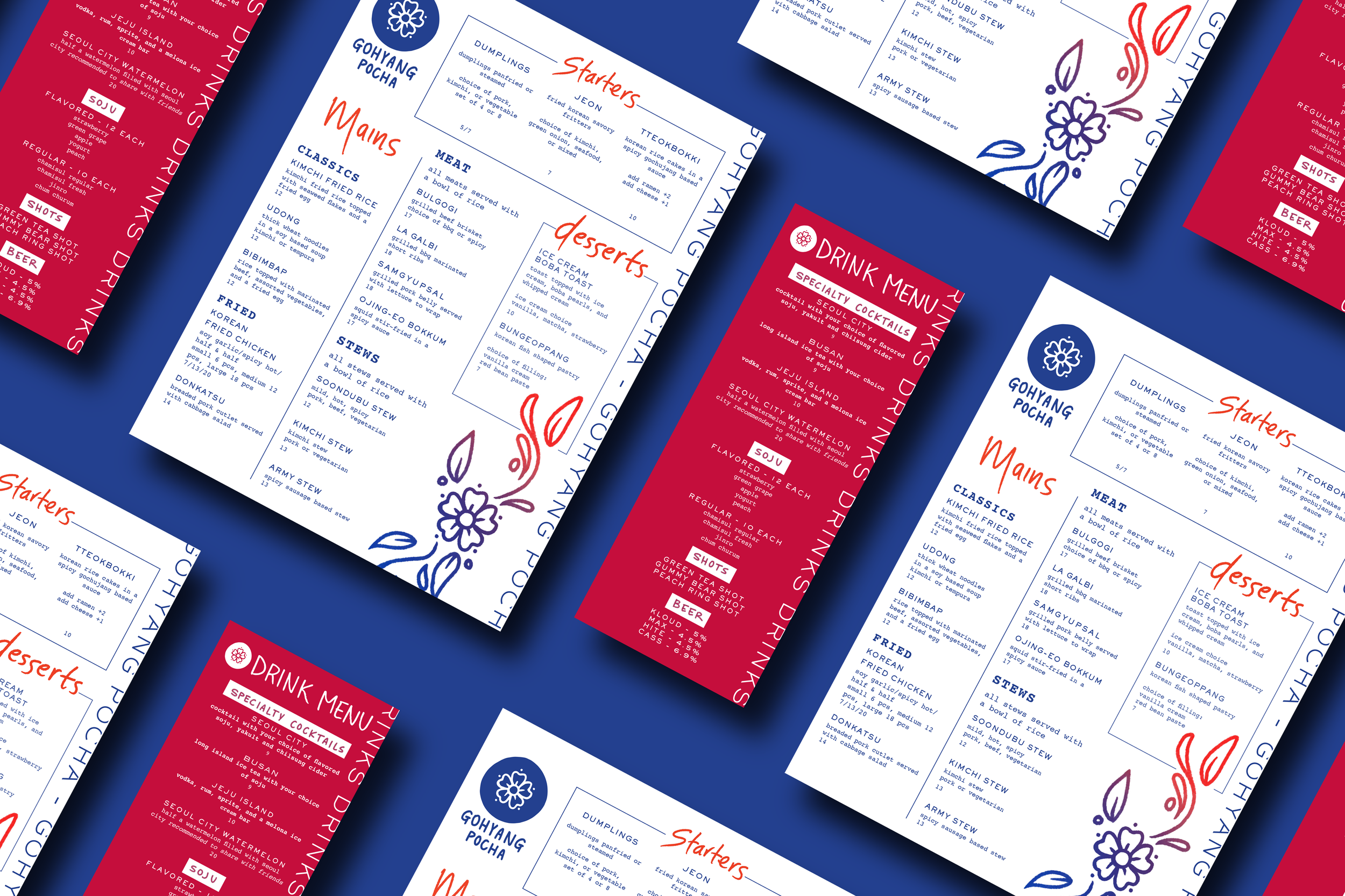
gohyang pocha
Inspired by the popular Korean pochas (which are casual side street stalls in Korea that serve food and alcohol), Gohyang Pocha brings all the latest Korean food trends to your table, making it easy to access. Set in the cultural hub of New York’s Koreatown, Gohyang Pocha will always have unique dishes and drinks that’ll spark your interest, and most importantly, your stomach’s.
Details
Instructor: Katey Stafford
Student Work, Tyler School of Art & Architecture
Elements
Branding, Packaging. Layout. Illustration
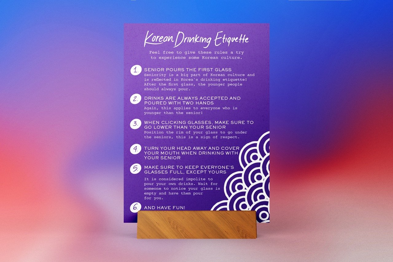
Gohyang Pocha is a casual, inviting, and vivid place to bring your friends to grab a drink, eat some good food, and wind down after work. Gohyang, meaning “hometown” in Korean, wants to remind you of home, even if you aren’t Korean. This is a great place for those new to Korean food and Korean food veterans. Come in, have some fun, and learn how to play Korean drinking games! 짠 Jjan! (Korean for cheers)

Logo Development
I wanted to mix traditional and modern Korean design elements throughout the project. One of the ways I wanted to show this was with the logo. While reviewing the initial ideas for my logos, I liked the idea of having a stamp-like look. I made many variations, trying different shapes and layouts. While researching traditional Korean designs, I noticed flowers were often used, and I incorporated them to give a visual element to the logo. I decided that handwriting my logo gave it a more casual and warm look.


Patterns and Illustrations
The patterns that I used throughout my branding mainly derived from the flower from my logo. I created an illustrative version of the flower by adding stems and leaves (which would be later used in my menu) and then another version where the flower was repeated over and over again. I also created a set of food illustrations I originally wanted to use in my menu but ended up using everywhere else, especially in my posters.


Environmental design elements included several posters and a neon sign. The posters were designed to be stand-alone or work together as a system. Bold, bright colors would become a recurring theme in my secondary design elements (then influencing the rest of my designs). They would help solidify the welcoming vibe I wanted Gohyang Pocha to have.

