

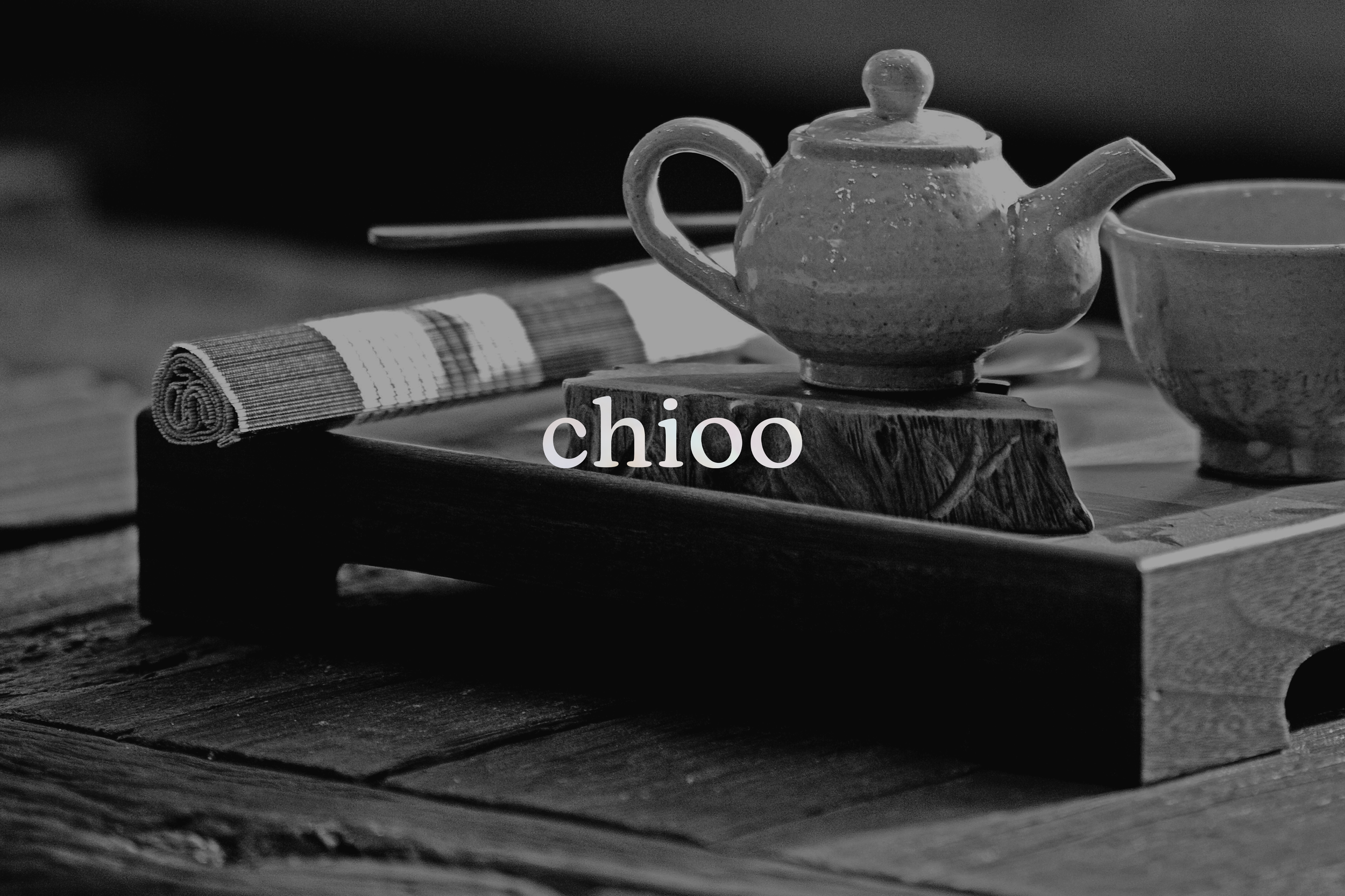
chioo
Chioo is a Korean tea brand that emphasizes relaxation and inner healing. Specifically, I attempted to create a strong branded curated tea kit for Chioo. I’ve always been fascinated with mother-of-pearl lacquerware due to its elegance, and I knew I wanted to make it part of the aesthetic. Each of the 10 tea flavors in the kit is based on the 10 elements of longevity, which are elements found in traditional Korean art that were thought to bring the viewer an abundant life.
Details
Instructor: Scott Laserow
Student Work, Tyler School of Art & Architecture
Elements
Branding, Packaging, Illustration, Layout, UI/UX
Reframing the problem

While trying to brainstorm ideas for this project, I wanted to create something health or food related. After much consideration, I chose to create a Korean tea brand. The question now became: how do I make tea “hip” and stand out from other teas? Tea is something that has existed for so long, so I knew that I wanted to create something unique.
Tea has been long ingrained in Korean culture. During olden times, tea ceremonies were very popular among all Koreans, no matter their status. Nowadays, tea has risen back to popularity as a means to calm and slow down the fast paced lifestyle in Korea. I wanted to reflect on this new re-emergence of tea and highlight the dying art of the mother-of-pearl inlay.
Research
Chioo is a tea brand with a mother-of-pearl aesthetic. Mother-of-pearl is something that I’ve always loved. In Korea, mother-of-pearl is cut into delicate shapes and inlaid with black lacquer, creating decorated pieces of furniture or wooden objects. This art is called ‘najeonchilgi’ and my first encounters with it were with boxes that my grandparents owned. Eventually, my dad bought me my own little jewelry box covered in beautiful flowers. Unfortunately, it is a dying practice as most pieces are now factory-made. I knew for my thesis that I wanted to incorporate this aesthetic somehow and help preserve and promote it.
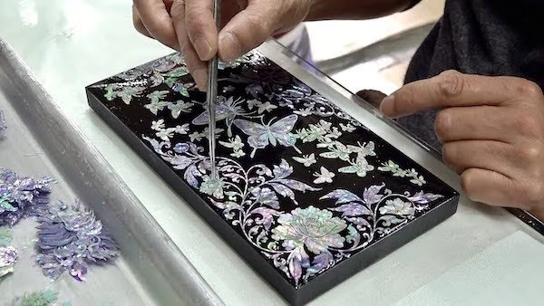
Artist placing the mother-of-pearl pieces onto a lacquered surface.
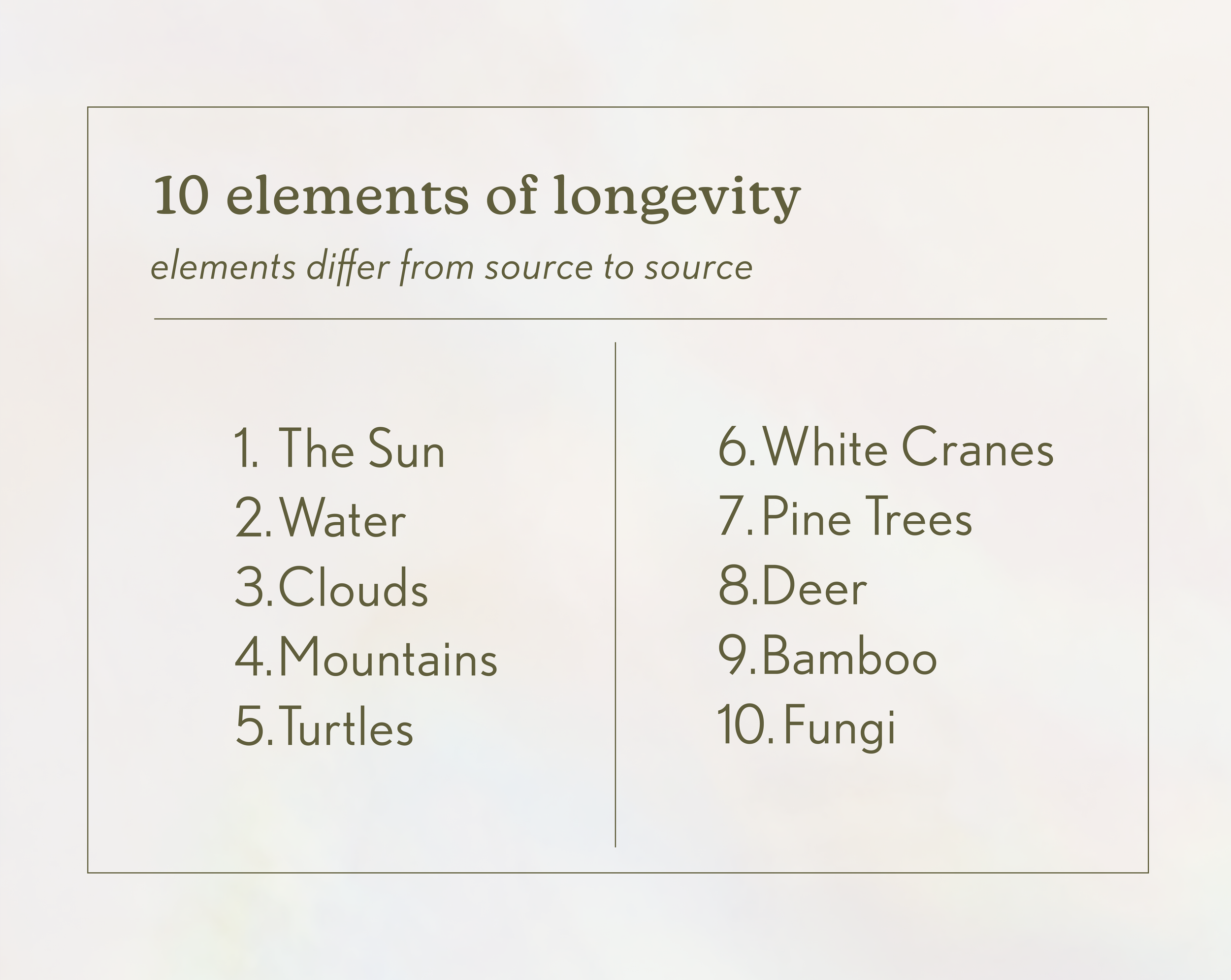
After further researching Mother-of-pearl, I stumbled upon the 10 elements of longevity. The 10 elements of longevity are elements used within traditional Korean art that were thought to bring viewers an abundant life. With such significant meaning, these elements were found in most art pieces, especially within mother-of-pearl inlay. This gave me the perfect foundation in which one tea flavor would correspond with one of the 10 elements. With the idea and the aesthetic in mind, I was ready to start designing.
Logo
When I first started to think about the logo, I entertained the thought of it having a logomark. However, while developing the icons for the 10 elements, I thought it would become too complicated on a small label and decided a more minimalist approach would be better. I chose to keep the logo for Chioo simple and created an elegant typeface that relayed the vibe of my brand that I wanted.
Labels
Each of the 10 flavors of tea corresponds with an element and a color. It was important to me that each tea would be able to stand out when placed next to each other. The colors of the labels were inspired by the beautiful pastel colors that reflect within mother-of-pearl. As sustainability is something that is important to me, I wanted Chioo to reflect that.
With this idea in mind, I decided to make the teas come in metal tin cans. The tin cans themselves also come in a tin package, wrapped up in a branded handkerchief to keep the metal from clanking around and creating noise. The thought process behind that was that each piece would be able to be repurposed after the tea was all done and used.
Accessories
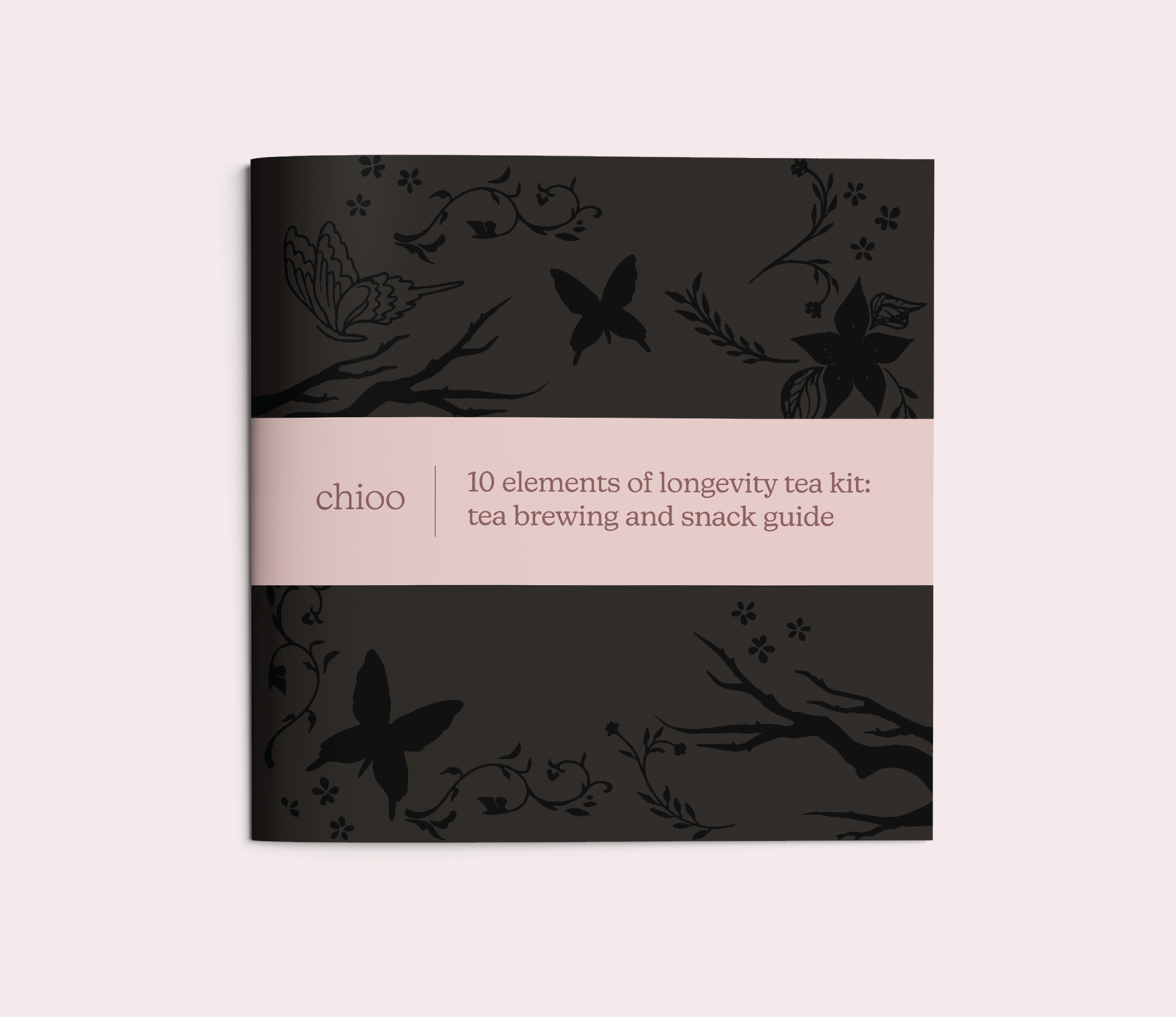
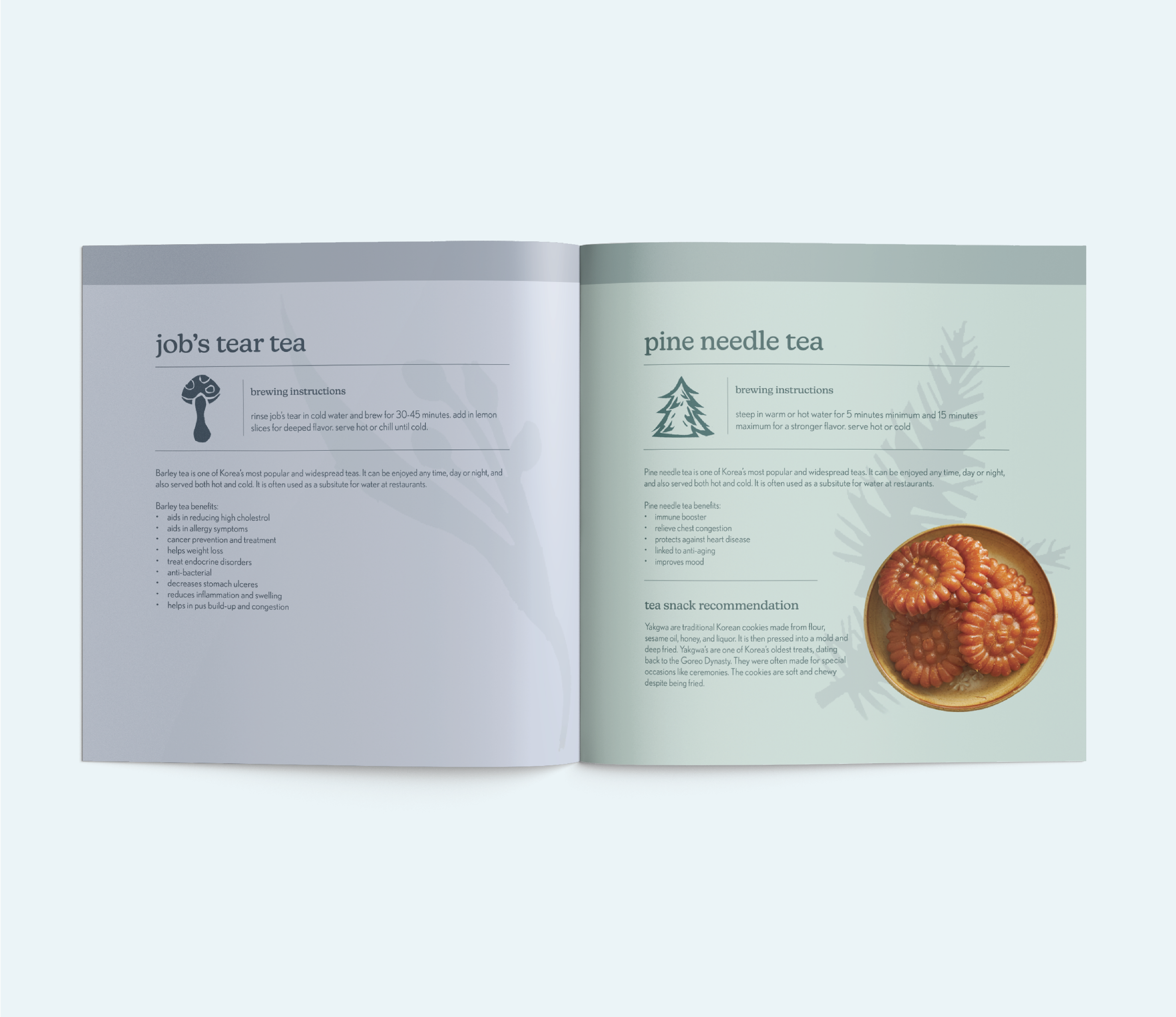
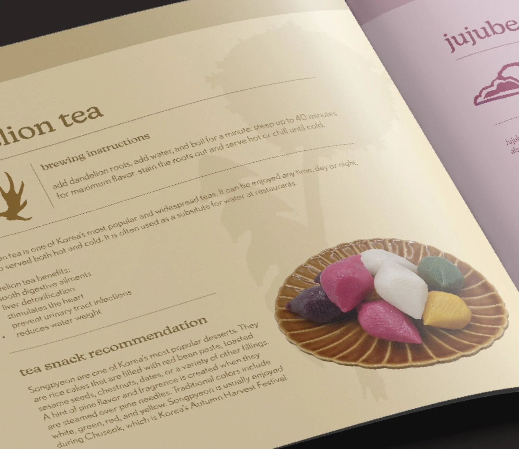
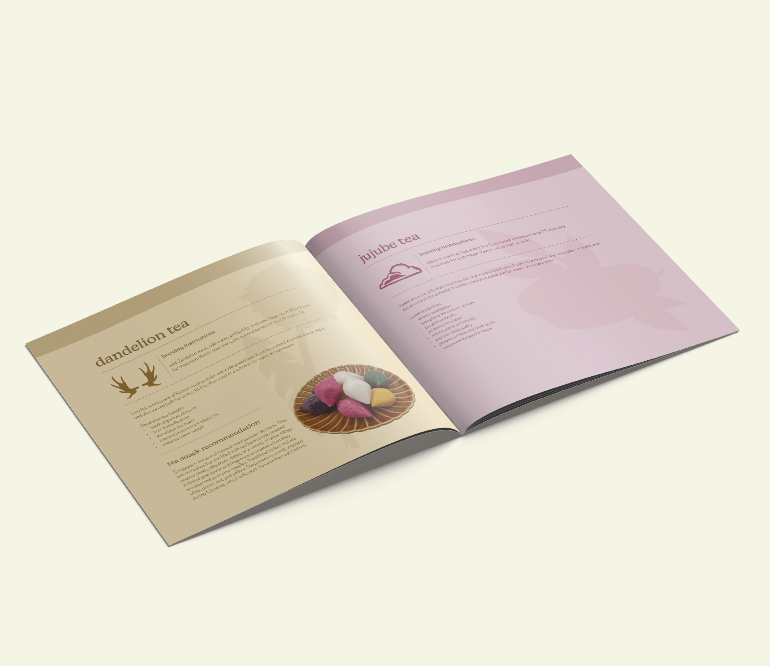
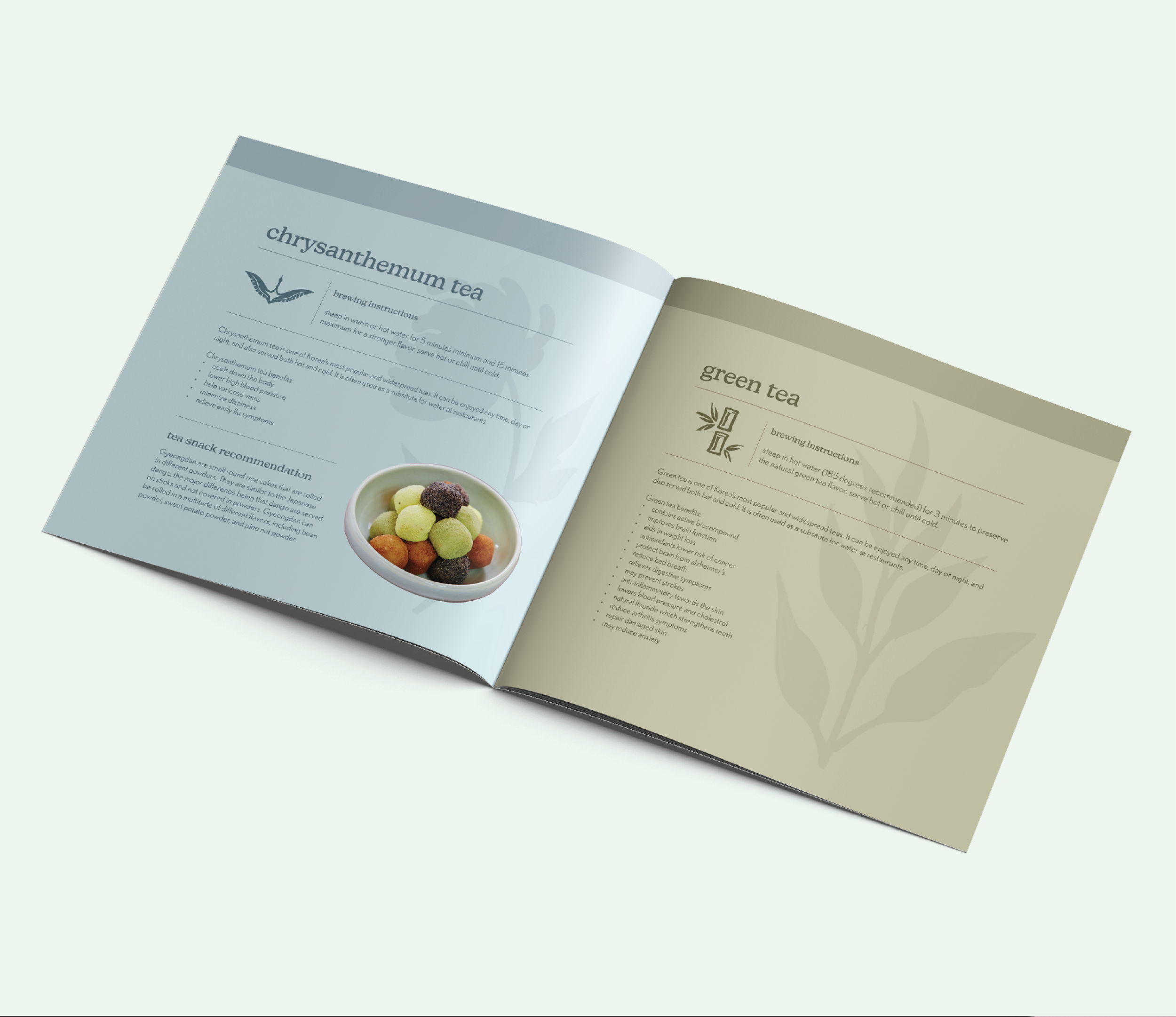
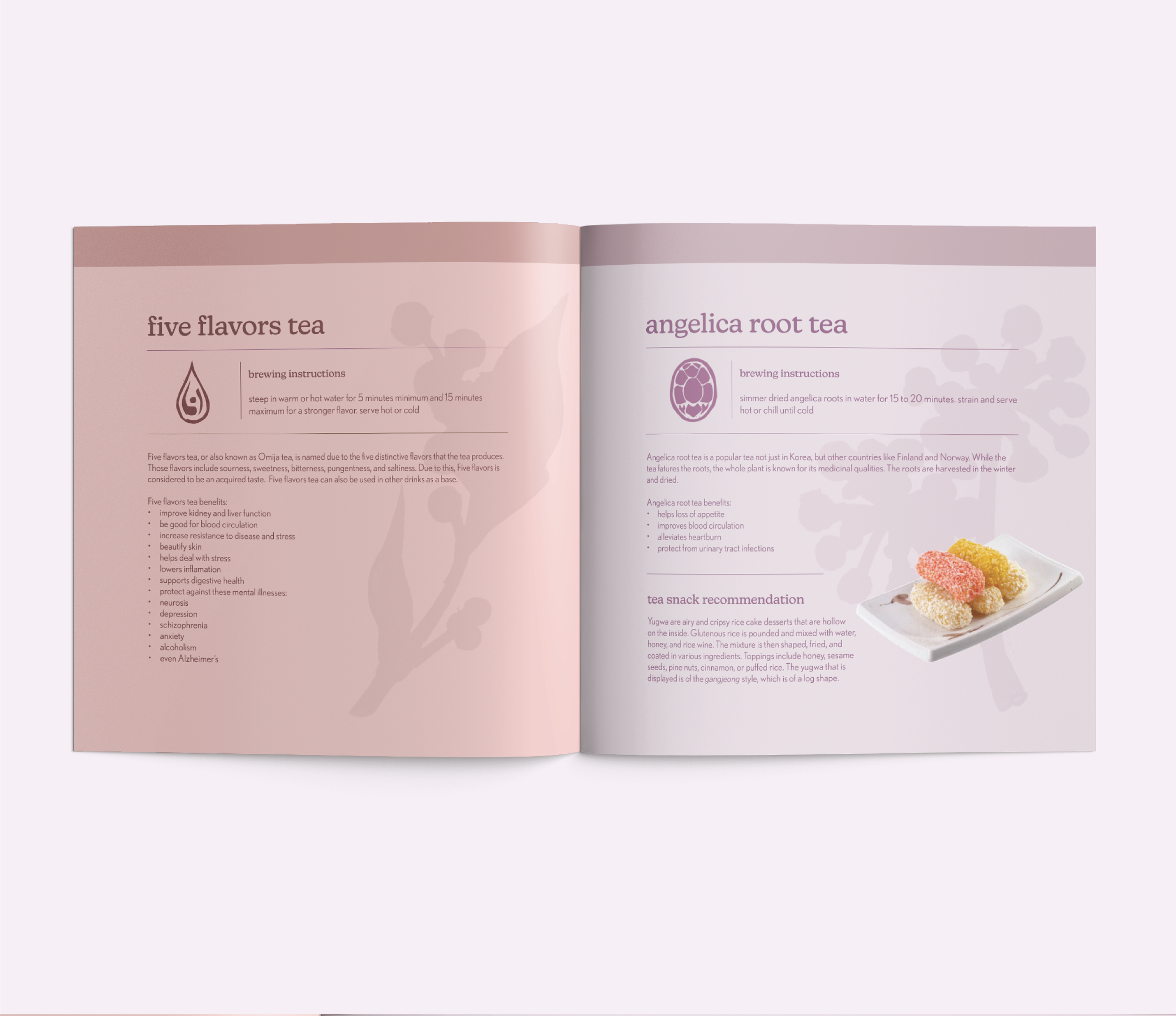
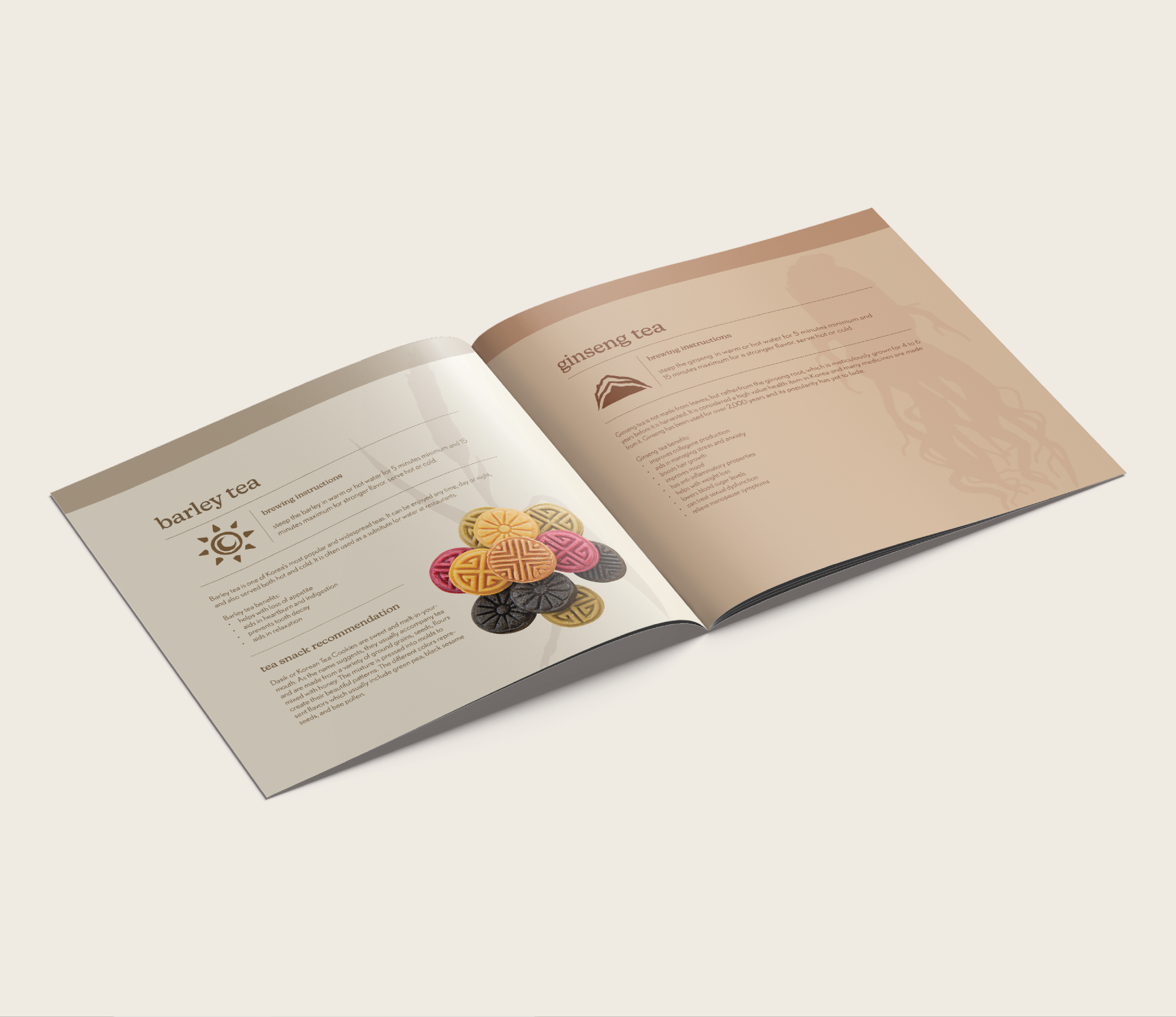
In addition to the tea kit, customers also receive a small pamphlet, a jar of honey, and a tea steeper. The pamphlet guides them on how to brew the tea and what snacks to accompany the teas. Each tea flavor got its own page detailing the brewing instructions, serving recommendations, and health benefits. This was a very crucial part of the tea kit as it is where most of the details are held. I made sure to keep it simple and reflect the design choices that I was already making up to this point.


After all the elements of the tea kit were created, I shifted my focus to creating effective communication with Chioo’s consumers. Since Chioo is a more upscale brand, I wanted to create a physical mailer that would be sent out monthly. A 4 fold brochure detailing new products or flavors would be included as well as a free sample of tea to allow customers to branch out and try new things.

Social Media + Website
To really complete this brand and fill it out, I created Instagram posts. In order to keep Chioo very approachable and easygoing, I went with lifestyle posts, mixing in real-life photography alongside the products that I created. The website was exciting to work on as I got to see all my work on one page. I kept both of these parts simple, trying to focus on type and colors that I used throughout the branding. Since not all people may be familiar with Korea tea flavors, I also created a tea quiz on the website so that people could get recommended flavors.


Conclusion
In conclusion, Chioo was one of the most rewarding projects that I have worked on. I got to use the design skills that I have gained throughout my years in college and make a passion project come to life.